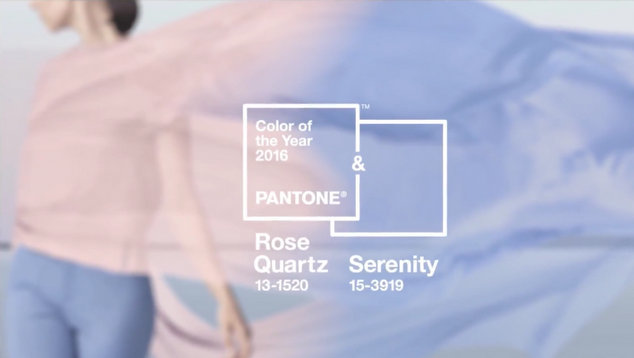
Every year Pantone names a ‘colour of the year’ for the next twelve months. The annual announcement sends designers rushing to replace their scatter cushions with the ‘on trend’ shade.
2015’s colour of the year was Marsala, and before that orchid, emerald, tangerine tango were the leaders of the pack. For 2016 the company has broken with tradition and named two complimentary colours as their colour of the year.
The hot (or should that be cool?) hues for 2016 are rose quartz and serenity. Pantone have explained the reason they went with two colours for 2016 is to make a point about gender fluidity.
Announcing the colours of the year, Pantone said the colours proviked a feeling of peace and reflection, something that people are often seeking in the busy world.
“As consumers seek mindfulness and well-being as an antidote to modern day stresses, welcoming colors that psychologically fulfill our yearning for reassurance and security are becoming more prominent. Joined together, Rose Quartz and Serenity demonstrate an inherent balance between a warmer embracing rose tone and the cooler tranquil blue, reflecting connection and wellness as well as a soothing sense of order and peace.” Leatrice Eiseman from the Pantone Colour Institute said.
The company also said the choices were an acknowledgement of how younger people are at ease with notions of fluidity in the gender spectrum.
“The prevalent combination of Rose Quartz and Serenity also challenges traditional perceptions of color association.
“In many parts of the world we are experiencing a gender blur as it relates to fashion, which has in turn impacted color trends throughout all other areas of design. This more unilateral approach to color is coinciding with societal movements toward gender equality and fluidity, the consumer’s increased comfort with using color as a form of expression, a generation that has less concern about being typecast or judged and an open exchange of digital information that has opened our eyes to different approaches to color usage.” Leatrice Eiseman said.
Add a little white to the mix and you have the colours of the transgender rights flag.
OIP Staff


