
Former Speaker of the House, Bronwyn Bishop, says the fact the Department of the Prime Minister and Cabinet approved a logo for a women’s network that reminded people of genitalia is proof that support for transgender women has gone too far.

The federal government has removed a logo representing a new initiative from the Department of the Prime Minister and Cabinet to support women after it was relentlessly mocked online.
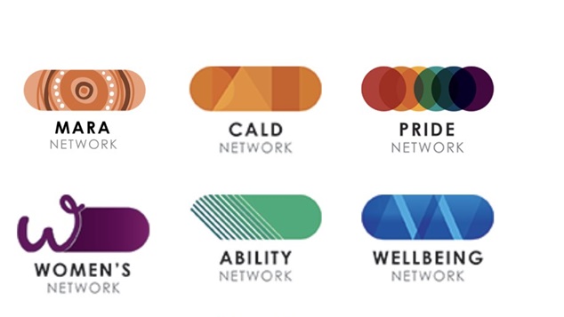
The logo had been criticised for resembling male genitalia, while others said it curvy use of the letter W was reminiscent of breasts. Some commentators on the other hand said the logo reminded them of a tampon. Whatever you saw in the ‘magic eye’ of logos – none of the answers were suitable for a logo representing a women’s initiative.
Appearing on The Rita Panahi Show on Sky News, Bishop said she couldn’t accept that logo was the result of a major stuff up in the approval process. Bishop saw it as a sign of infiltration of ideas in the nation’s highest office.
“I think it’s a bit more serious…I think it shows how the concept of attacking women for being women has permeated every sense of the bureaucracy, and people who come up with this sort of stuff.
“It’s saying you can’t just be a woman, so you can’t just have a symbol representing women, now they want to represent people who identify as women but in fact have penises.” Bishop said, arguing that the logos phallic resemblance was a deliberate act.
The former Liberal politician said she didn’t believe the creation of the logo was a deliberate “conspiracy” within the public service, but was evidence over the spread of a particular way of thinking.
“How else could it get approved?” Bishop asked.
Fellow panelist Nicholas Reece, the Deputy Mayor of Melbourne, said it was easier to understand how to logo was chosen once you took at look at the web page it appeared on, alongside other similar logos for different programs within the department.
Bronwyn Bishop said she couldn’t accept the suggestion that a graphic designer had probably not thought through the design when under pressure.
“That doesn’t wash…this is at a very high level that this has been designed and been found acceptable, and the only reason it can be acceptable is because the idea that women are being attacked all the time for being women, we don’t have the reverse with men being attacked because women want to be men, it only happens with women.” Bronwyn Bishop said.
Department says PM had no involvement in logo’s design
The Department of the Prime Minister and Cabinet said the logo had been designed internally and Prime Minister Scott Morrison had no involvement in it’s creation or approval.
“In 2019, staff at the Department (PM&C) rebranded the staff diversity networks, which includes the Women’s Network, to establish a consistent look and feel.
“The Women’s Network logo retained a “W” icon which staff had been using for a number of years.” the department said in a statement.
The department denied that the creation of the logo had been at any significant cost to taxpayers.
“The rebrand was completed internally, using existing resources, and designs were consulted on widely. No external providers were engaged for this work.
“The Prime Minister and the Prime Minister’s Office were not part of this logo design.”
OIP Staff

You can support our work by subscribing to our Patreon
or contributing to our GoFundMe campaign.

